
rough, incomplete
COVID19 lockdown critics in the UK have frequently argued that infection rates or related deaths
had "peaked" very early, in mid-March. I've encountered four reasons to say this, as offered by three experts some find trustworthy, and by circumstance:
1) Prof. Paul Heneghan called peak infections on 3-16 because it's 21 days before peak deaths on 4-8 and he notes infection rates of some kind halved after that.
2) Isaac Ben-Israel decided the virus spreads to a peak in 40 days, declines to near zero in 70 days, no matter where or what people do. By that, UK peak infections would be around March 13.
3) Math hoaxer Andrew Mather finds March 16 has the highest increase of … daily total death vs. prior total given as a percentage? ... which ... means something? This is the one I consider in most detail here.
4) What I suspect is the real reason: A peak then would be just before social distancing suggestions gave way, between Mach 18 and 23, to the controversial lockdown of most commerce and stern admonitions to "stay home, save lives". They and/or their fans in the public wanted to see the crisis set to resolve naturally before lockdown, to prove that hated policy was a scam they can look heroic for fighting, or even that, as 21st Century Wire put it, UK Ministers "knew" the pandemic was wrapping up when they acted, clearly for some other reason.
1) Carl Heneghan is the Director of the Centre for Evidence-Based Medicine, based at Oxford University, and professor of same, at the same. I don't know how well he handles evidence to base medicine on, aside from these arguments about COVID19, and that doesn't seem encouraging. But his center is at Oxford, not in some strip-mall, so maybe I'm missing something.
Back on March 11 at just 456 cases and eight deaths in the UK, Henegan noted "the seasonal peak in winter respiratory illnesses has occurred; the normal year on year trend would see a continued downturn in infections and deaths. However, it is too early to tell: the next few weeks will determine whether the trend for a reduction in deaths is maintained, or whether the Covid-19 outbreak takes hold and leads to more infections and rising mortality." A few weeks later, we could see it had taken hold, but he seems to argue it had peaked about then and was declining, as cited in a Daily Mail article of April 20: "[Heneghan] refers to a delay in the time it takes for an infected person to fall seriously ill and die - three weeks on average. He claims that if the Government accepts that deaths peaked on April 8, then it must mean that infections were at their highest around three weeks prior." He presumes that was a high, IF the 8 April peak was a real high (the 10th was the actual peak: 980 dead in one day) followed by a real decline (followed, with a long delay, staying around 800/day on average for nearly two weeks after - that whole thing is the long peak, IF there's just one peak). If March 16 was the peak of new cases (it wasn't), then rates would have dropped since then, and logically might continue. There's no mention of his checking actual data and seeing such a drop, and as it happens there isn't one.
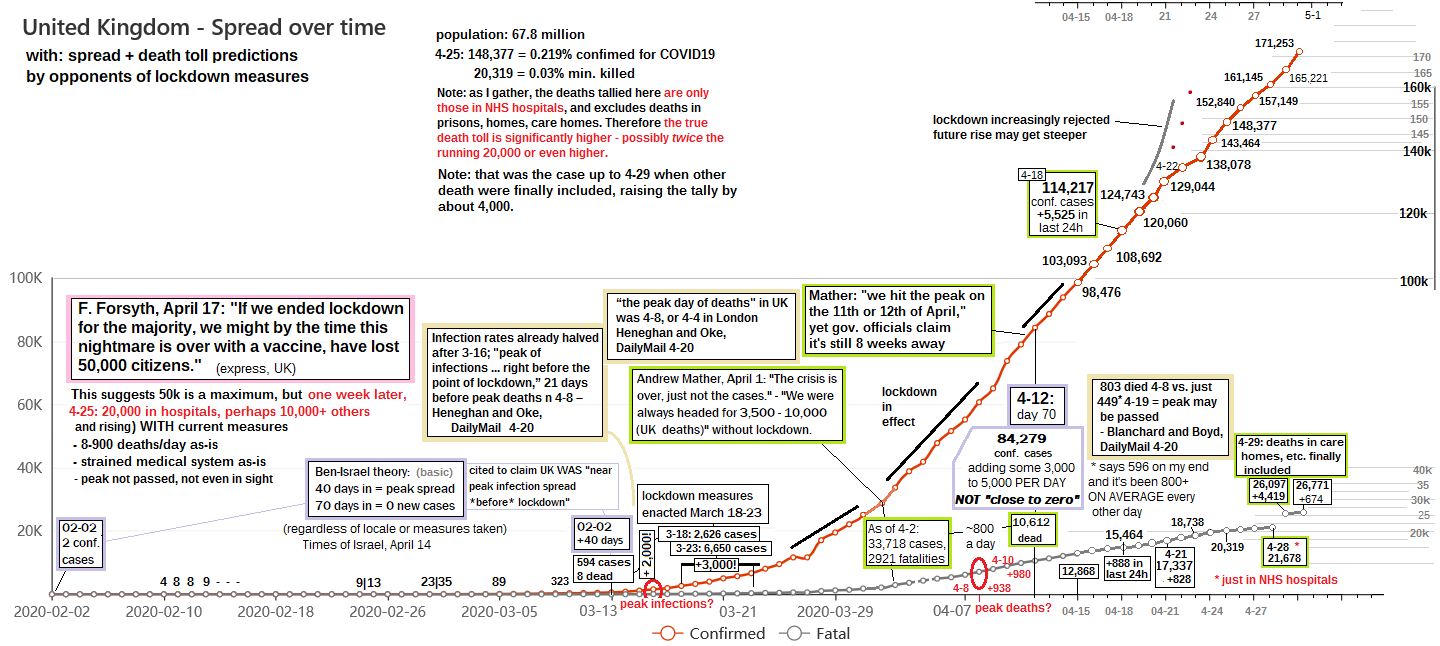
The time he guesses should be around March 15-16, and the 16th came up especially as a point where rates of something dropped, which is taken as suppoting the guess. "Data shows the rate of Britons with upper respiratory tract infections dropped from 20 per 100,000 people on March 15 to around 12 per 100,000 just six days later. The figures do not relate solely to coronavirus but may be a good indicator because so few people were being tested for the deadly infection." That's clearly lame, and apparently the figures don't relate AT ALL to COVID19. The article included this image, captioned "Royal College of GP data shows the number of people with flu-like illness in England and Wales dropped by 50 per cent when hand-washing and social distancing was encouraged on March 16. Professor Heneghan says this is evidence full lockdown was not necessary." In fact the same vague numbers (green line) show coronavirus cases increasing sharply at the same time - presumably less sharply than they would have, but still rising to 5 per 10,000. I haven't checked this against the data, but the flat week April 5-12 looks perhaps too flat, and I don't know about the start and the rise, but it's clear there was a rise abut then, while prof. Heneghan insisted it "must" have started declining then.

But it turns out there's a kind of COVID19 infections number - one of no relevance - that DID roughly halve after the 16th. We'll come back to that in point 3.
2) Times of Israel reported on April 14 the findings of Isaac Ben-Israel, "a prominent Israeli mathematician, analyst and former general," "head of the Security Studies program in Tel Aviv University and the chairman of the National Council for Research and Development" and he also "heads Israel’s Space Agency." Wow. Another mathematician, but one presumably dedicated to the safety and well-being of the nation he serves, and highly competent. And here he slams economic closures in Israel and elsewhere as disproportionate responses to a virus that apparently gets bored and stops bothering people in a certain country after a few weeks. Maybe he's hoping the idea catches on in Iran. He "claims simple statistical analysis demonstrates that the spread of COVID-19 peaks after about 40 days" (and thus, 40 nights) and then "declines to almost zero after 70 days - no matter where it strikes, and no matter what measures governments impose to try to thwart it." He completely fails to explain why this would happen, simply claiming that it does, according to the numbers, which don't lie.
But if 40 days to "play out" means after he first reported case, it's pretty well disproven as a general pattern, even checking against the nations he cites as examples (Sweden, Singapore, Taiwan). If he has another measuring point, it's unspecified and would probably prove wrong as well. Taiwan is the most fitting to his description, with no others close to conforming. And in Taiwan as everywhere, it's impossible to separate natural progression from human-imposed limits.
https://libyancivilwar.blogspot.com/2020/04/covid19-experts-and-fake-curve.html
As it happens, in the UK 40 days in is March 13. That's a rough and variable number (about 40 days - unless he meant divinely-ordained 40-days/40-night, which I guess would be exact). So this could be seen as fitting the other indicators pointing to a mid-March peak. To Ben-Israel, that would have nothing to do with the distancing and hygiene measures taken then, as Heneghan suggested. He'd say it's just how this virus works, with some never-before seen self-destruct mechanism that kicks in just early enough to make counter-measures seem unneeded. How that maps out against actual data is included in the big UK graphic at top, in the blue-gray boxes.
3) More from Andrew Mather or Math(hoax)er. I spent too long in my last post re-explaining the logarithmic optical illusion he passed off as showing some real declines in every nation's infection rates - the artificially flattened curve he gets with this trick looks similar to China's aggressively contained spread, so he slapped them together misleadingly to suggest a natural mellowing akin to what Ben-Israel imagines, and at least in the UK, coming out on a similar timescale.
His latest video includes a few more confusing graphics ...
https://www.youtube.com/watch?v=QjyhGboI4C0
https://peerlessreads.s3.us-east-2.amazonaws.com/CV19FNF_NoMoreLiesItsOver_200425a.pdf
At 3:15 he shows "ONS registered deaths, COVID19 involved" labeled "Daily Growth" but also, on other slides, it's "rate of decline for new-daily deaths" or "the death and case new-growth rates" which "just keep going down, as they have done since day one." (meaning since this peak of something on March 14 or 16, not since first confirmed cases on Feb. 2). I admit I'm a little hazy just what these and other figures are supposed to show, but here are two cropped slides from the PDF version that I decided to try and explain. In both cases, the jagged blue line shows the falling UK number(s), and come with reminders that the peak deaths and cases has passed, suggesting the graphs show the decline from that point.


Whatever this number is shown by the jagged blue lines, it visually seems to decline on balance, from a high at graph's start on 3-16 to the present, where it seems both much lower and more stable, likely to settle at zero any time now. But is a zero "decline for new-daily deaths" good, bad, or just dependent?
In this presentation, Mather says - as he has before - the same curves include numbers "breaking through 100% (peak deaths) on the 10th/11th April, in line with 11th Peak in Cases." But the visual shows an apparent high on March 16. That's on a scale given in percentages. Is it % compared to April 10/11 as 100%? No, because no other day should have more than 100% of the peak (highest day), or that other day would be the peak. But April 10 itself plots out at 15%, not 100 (and that 15% represents 980 deaths that day). Then March 16 plots about 165%, and that refers to just 34 new deaths. 34 clearly is not 165% of 980. This whole thing has some meaning other than the one visually suggested.
...
Main data source: https://bing.com/covid/local/unitedkingdom?form=COVD07
This seems to use the same WHO numbers everyone else does, although I've seen smaller tallies in some spots, etc. I used each day's increase AS a percent increase over the prior total for the orange plots on a scale ranging from 0 to 170% … working manually with my cell phone's calculator, I might have a point or two wrong - anyone can check - the list below has all the numbers I used - possibly with wrong spots as well. In these two example entries, you get the orange plot by dividing the 10 on line 2 by the 11 on line 1, for a 91% increase.
date - new total - daily - %
3-14 11 +1 10%
3-15 21 +10 91%
This I overlaid with the blue curves from Mather's slides 1 and 2, lined up by dates and somewhat by value. As noted, his start point ~165% has the same basic number I found for that day (162%) and should line up as here. If the lows are also aligned, a middle peak on 3-28 also lines up. But between these points, all his numbers and lines come out different, seeming more "plausible" than my orange plots, Note these blue curves don't even match each other, but all three seem to share a general pattern dropping from about 160 to about 5% over the same time, just variously distorted. that says to me he's using this base method, along with some other math trick that mellows out the wild dips and rises of this irrelevant number, or maybe he's just drawing in "plausible" lines between the real highs and lows.
...

notes:
* At one point, Mather says the plotted data was "delayed 4 days to best reflect WHO data." The best pattern match-up comes from lining up the dates directly, with no 4-day shift.
* At another point, he says the peak % increase was on 15 March when 2 deaths jumped to 11. But on my end 11 was reached on the 14th after climbing to 3, 6, and 10. The jump is on the 16th, from 21 to 55, and that's the 162% he shows as the start point in slide 1.
...
date - new total - daily + - %
3-6 0
3-7 1 +1 inf.%
3-8 2 +1 100%
3-9 2 +0 0%
3-10 3 +1 33.3%
3-11 6 +3 100%
3-12 10 +4 66.7%
3-13 10 +0 0%
3-14 11 +1 10%
3-15 21 +10 91%
3-16 55 +34 162%
3-17 71 +16 29%
3-18 104 +33 46.5%
3-19 144 +40 38.5%
3-20 177 +33 23%
3-21 234 +57 32.2%
3-22 282 +48 20.5%
3-23 335 +53 18.8%
3-24 422 +87 26%
25 465 +43 10%
26 578 +113 24%
27 578 +0 0%
28 1,028 +450* 77.9%
29 1,228 +200 19.5%
30 1,408 +180 15%
31 1,789 +381 27%
4-1 2352 +563 31.5%
4-2 2921 +569 24.2%
4-3 3611 +690 23.6%
4-4 4313 +702 19.4%
4-5 4932 +619 14.4%
4-6 5373 +441 8.9%
4-7 6159 +786 14.6%
4-8 7,097 +938 15.3%
4-9 7,978 +881 12%
4-10 8,958 +980 12%
4-11 9,875 +917 10%
4-12 10,612 +737 7.5%
4-13 11,329 +717 6.8%
4-14 12,107 +778 6.9%
4-15 12,868 +761 6.3%
4-16 13,729 +861 6.7%
4-17 14,576 +847 6.2%
4-18 15,464 +888 6.1%
4-19 16,060 +596 3.9%
4-20 16,509 +449 2.8%
4-21 17,337 +828 5%
22 18,100 +763 4.4%
23 18,738 +768 4.2%
24 19,506 +768 4.1%
25 20,319 +813 4.2%
26 20,732 +413 2%
3-27 21,092 +360 1.7%
3-28 21,678 +586 2.8%
--- graph end
3-29 26,097 +4,419** 20.4%
3-30 26,771 +674 2.6%
* a clear 2-day tally following a blank day
** adds previously excluded deaths in care homes, etc. (outside NHS hospitals) + unclear daily tally
...
No comments:
Post a Comment
Comments welcome. Stay civil and on or near-topic. If you're at all stumped about how to comment, please see this post.