Warning

Warning: This site contains images and graphic descriptions of extreme violence and/or its effects. It's not as bad as it could be, but is meant to be shocking. Readers should be 18+ or a mature 17 or so. There is also some foul language occasionally, and potential for general upsetting of comforting conventional wisdom. Please view with discretion.

Monday, March 15, 2021

Do Videos Show Liwa Al-Islam Launching the 2013 Ghouta Sarin Attack?

Ghouta Chemical Massacre(s)

by Adam Larson (ka Caustic Logic), March 15/16, 2021

updates 3/20, 4/18...

Note: This post is fairly complete AND readable at long last, but may be rough in spots, and all-told pretty long. See the summary, and the article can be skimmed for specifics of interest. Considering the importance of it, this will have to stay open to revisions and updates at least.

Summary: What follows is, in my mind, a near-certain case that the dubious 2013 "Liwa al-Islam volcano videos" (as I'll call them) show the same rockets used in the August 21 alleged sarin attack, fired at the same angle from the same place as that attack, on or close to August 21, which they said it was. The videos either show the attack or a very thorough re-enactment of it. 

Though limited, the video has enough scenery details to provide a remarkable match with a certain field - well-inside opposition territory - that is almost exactly indicated by the best-yet analysis of seven related rocket impacts; the estimated trajectories cross most reliably as close as 15 meters from this field.  And right where the launcher would have been if the videos were filmed there, the grass in this field is burned shortly before aerial views of August 23. 

This likely identifies the exact firing spot, and confirms the videos as extremely relevant all at once. Again, this spot is firmly within opposition-held territory, although it is close to the front lines at the time. Furthermore, as already established, it's very near a reported incident just 3 days later also involving alleged opposition use of sarin.

---

The Basic Firing Area

Since the days after the 2013 Ghouta attack stunned the world, many firing locations have been proposed for the reported 12 sarin-filled rockets deployed. Some efforts were based on reading the physical evidence that tended to point close to due north or, sometimes, in a northwest direction. Pointing north to rebel turf was taken as a best reading to factor in when, in 2017, "Rootclaim’s algorithm concluded overwhelmingly that the opposition was the most likely culprit." That was the finding of the excellent "Who Attacked Ghouta" blog, and several others. But these were mostly summary exercises or based on reading just one confusing impact scene extrapolated to the rest. 

About a year ago, I wrapped up some re-analysis of rocket impacts and trajectory estimates relating to the attack, using some amateur skills I had acquired in the interim. It's only a little bit fancy, mainly taking persistence - in this case off-and-on persistence over a few years. Following some work with Michael Kobs, Chris Kabusk, Qoppa999 and others, I left that for the time in good shape, with every impact that could be placed done so and an angle of fire estimated. 

Michael drafted a PDF summarizing our findings quite well, at least at an introductory level, with ample illustration to get the main ideas and, by and large, to get convinced. 

https://www.docdroid.net/t7cVSc6/ghouta-chemical-attack-locations-angles-pdf 

* ACLOS alt. posting, added 3/20: File:Ghouta chemical attack - Locations Angles.pdf - A Closer Look On Syria (shoutwiki.com)

Some of it via my own notes was assembled here. This work is crucial and deserves even better summation than what's available. But for the moment we need to leave it there, and here summarize the significant parts and the newer findings. More than ever, it seems we've been on the right track, and now perhaps we've gotten to its end. As the truth often does, it seems to open onto other truths, to be related in this article. 

This summary graphic from Michael's report shows trajectory estimates for five "volcano" rockets claimed as part of the attack. 


Documented impacts across the Zamalka and Ain Tarma districts were mapped following careful geolocation (including by others but verified, and original work). The damage was carefully assessed from many images leading to a range of angle/trajectory estimates meant to be definitive, including all reasonable wiggle-room, and with varying centers of greatest likelihood not shown here. This is traced back 2 kilometers (the approximate maximum range of these rockets) to mark all the area it might have flown over. All of the paths show some kind of northwest origin. 

Another located impact has consistent angle but seemed like a different weapon (it may be worth re-including in future versions), and one more alleged volcano impact (UN-OPCW's site 5) has been placed and roughly estimated since this image. So as many as 7 analyzed impacts fit this same pattern.

The firing spot for each rocket should be somewhere within its triangular path, more likely near the far/wide end, or perhaps further out is possible (range calculations are sill debated, and I don't have my own estimate). But any single firing spot for all five would be somewhere in the intersection of all their triangles. Other details include how some range intersections (notably purple) makes any further than 2km in general unlikely. 

I made this based on the above just now: black outline starts where all 5 intersect and ends where just 2 of them do, with colored lines marking where each path estimate ends at 2km out. For what it's worth, middles usually work best, and near the green and blue lines is the most likely band to look in.

Also note the red and narrow triangle above is centered on an extra-clear reading of 316° +/- 2, from the UN-OPCW's site 4. Still, I decided to use 315 early on, after seeing or reading it at both 314 and 316, and also because it's nicely rounded off for simpler math and graphics - exactly 45° north of due west, or perfect northwest. It's still an estimate, the difference is tiny and here, it seems, makes my lines a tiny bit better. Anyway, the spot is more likely to be found along the red triangle's centerline, or maybe a bit west of that, and the whole span is possible. For it to be outside the red is also possible, but I would bet against it.

We'll come back to that area in a little more detail below. But first, I left off last February with a mapping using 315°, marking that line's end at 2km, and then drawing a coffin-shaped box (hexagon - it seemed like a good shape, where widest = most likely) around it. This stretches to almost a 2.25km max, a longer possible area further in range, and I added a bit of extra possibility in an outer gray hexagon. Note that this covers a bit more to the west than Michael's does centered on 316. At the outer end, the bus station's parking lot is a bit less indicated.

Areas of control in this map are per Higgins, Charles Wood, others, and reflects the situation on August 24. On the 21st, Tohme checkpoint was government held (unless someone fudged that timeline), but the northern triangle with AFV's probably wasn't. However, the rest of this - including all the areas of importance here - was probably the same as shown on the 21st. So my trajectory crossover "coffin" includes some of each side's territory.

And I left it off last year noting, as shown on that map and as explained at the same link, how the middle of that zone is just ~400 meters from an alleged incident about 2.5 days after the sarin attack, in which "opposition forces" reportedly fired two sarin-filled mortar shells at soldiers of the Syrian Arab Army (shells shown at right - one didn't work). At least four were badly affected, but none of them died. The SAA says it found a weapons facility in the immediate area after they cleared it, with more of the sarin-filled shells used. OPCW-certified labs confirmed sarin in the shells, and in the blood of one soldier (a month later - more presumably had it before the signs faded), but they did not confirm the whole narrative connecting them.

Now, within that black-bound area are some spots I shaded white. These are open fields suitable for rocket firing. I suppose some smaller spaces in there could work, and a parking lot at the bust station perhaps. One field stood out initially, along the middle eastern edge. Sometime before August 23, it was largely burnt, if in a general way many fields are, especially brown fields like this, and driven around on, besides taking some apparent artillery hits and having the fence breached for access. The southern half seems extra-burnt, and seems to die off and stay gray from then on, or is filled over with gravel. This still seems like a possible fit, but as I'll explain, another spot nearby proved far more compelling in its relevance.

Some Whodunnit Basics
At right is "volcano" rocket #165, one of those blamed for the sarin attack, but removed from its unclear original impact. These were first and most notably researched by Eliot Higgins (later Bellingcat founder, "Brown Moses" blog at the time). He first called them UMLACA (for Unknown Munition ...), later found they were called Volcano by the Syrian military, and has called them that since.

The volcano was a nearly unknown weapons at the time, and and looked improvised and thus likely militant-made. But Syria has to improvise too. Aside from many others, Higgins and "Sasa Wawa" at the "Who Attacked Ghouta?" blog agreed the government or one of its allies probably improvised the volcano and had so far used them mainly, if not exclusively. I don't dispute that general consensus at all. But like Sasa Wawa, I can't endorse Higgin's acceptance they have a sarin version as well, plainly marked with red instead of black numbering. The more reliable evidence only supports their use as conventional or fuel-air explosives.

I think both Higgins and "Wawa" have acknowledged it's entirely possible these can be seized, whoever made them. Both sides are known to take and even re-use each others weapons as a matter of course. Sasa Wawa did more than acknowledge it here, and over here learned of a nearby UMLACA staging ground at Qadam station was overrun by opposition fighters in January, 2013, possibly stealing some units then, for example.

Similar issues apply to the sarin inside those rockets (or just later found on them?). It's understood the Syrian military had the capability to field the deadly nerve agent. There's little to no evidence anyone has stolen their materials, but there's a fair amount about the insurgents making their own sarin. This is often claimed as definitely beyond the reach of terrorist groups, except of course for in Japan 25 years ago. And with nothing reliable about the different formulas used by either side, save for the debatable hexamine connection, it's hard to be sure the yellow, caustic, foul-smelling 60/40 mix of sarin and impurities that keeps turning up comes from a high-end government-funded program or a terrorist lab, as the Syrians and Russians have been saying all along. The August 24 incident mentioned above is just one of several examples where SAA soldiers or allied forces are the targets of sometimes deadly sarin attacks, dating back to December 22, 2012.

Areas of control also can be pierced, but it's less likely, and an attack coming from one's "controlled area" as they say is a better indicator of guilt. The UN-OPCW investigation, Higgins, and many others have found or indicated a great many Syrian military installations the attack likely came from, every one seeming to serve as effective proof. And now we have trajectories that converge mainly on opposition turf, but a bit on the government side, and near a crossing either side could use. And whoever chose to attack from this close to the front line might be trying to implicate the other side (false-flag - an almost ancient concept), raising the motive to cross right over. I don't suspect anyone did, but it still seems possible.

In short; 
- the claimed allegiances of an attacker, the weapons used, and the involvement of sarin are all quite inconclusive as clues 
- while area of attack staging isn't certain, it still seems the best indicator of the lot 
- all of it should be considered in the fullest context possible.

Are the Liwa Videos Real Evidence?

I never expected to make much of the "Liwa al-Islam volcano videos" of contested relevance. These appeared online in mid-September, 2013, with an original description / explanation from the previously unknown source (as passed on by Higgins at his Brown Moses Blog):
"September 15. Kurdish Peshmerga killed three Syrian terrorists on border. They found cell phone in pocket. Night bombing video there. Terrorists on video wear gas masks. Video was shot August 21. One terrorist name it Storm operation."
The videos were allegedly made by fighters of Liwa al-Islam (LaI or LI = Brigade of Islam - not banner, thanks Qoppa), a Saudi-backed sectarian gang based in Douma. It was founded and led  by Zahran Alloush ('til his killing by Syria in December, 2015), the charismatic and ruthless son of an exiled preacher harbored in Saudi Arabia. Alloush's Liwa al-Islam had brutalized their way into general charge of all Eastern Ghouta by August of 2013, co-opting other militias and allying with Al-Qaeda franchise Jabhat al-Nusra and others. They would soon after form a larger coalition Jaish al-Islam (Army of Islam) that would continue to rule over E. Ghouta or at least Douma up until April, 2018, and would be central in forging a nationwide "Islamic Front" thereafter.

Following the video release, Higgins passed on and seemed to agree with a statement of denial issued by Liwa al-Islam, via the alternate Syrian government in Turkey, SNC/ETILAF, but by now "The page does not exist." See then: Liwa al-Islam Brigade Issues a Statement in Response to Fabricated Videos - The Syrian Observer, dated Sept. 20, 2013. Their public face explained, in part, "Those videos were not published on our official channels. They are thus forged and completely fake." Well that's a pretty narrow definition of fake, allowing for easy dismissal of any leaked information, for example.

"Only the Assad regime has chemical weapons in Syria," they continued. "Assad admitted to that by agreeing to turn over his stockpile of chemical weapons to the international community." He agreed to this while blaming terrorists for every gas attack so far = "admitting" only he has CWs. Finally: "The UN team report, moreover, confirmed the rockets used in the attacks on August 21st were launched from regime-controlled areas." Actually what the UN-OPCW did is falsely finger Syria for the Ghouta attack without even explicitly saying it. The refutation of that terrible (error?) was a major inspiration for the better analysis that led us right into Liwa-controlled territory, as related up top. So that's a big fail.

2 rocket shafts, flag (video 2)
Higgins noted the men in the video "are shown to launch the same unusual munitions ... used in the August 21st sarin attack," the UMLACA/volcano he had just made some waves for tracing to Syria's military. In fact the men claim it is August 21 as they use these same rockets, which on camera they call "Ababeel." That translates as "flock of birds," possibly in reference to god-sent birds that chase off invaders in pre-Islamic mythology (Wikipedia). It's apt; Pakistan makes a missile with that name (Wikipedia). But there's no mention of sarin or anything similar, and they claim they're targeting "Assad's Shabiha" or "Assad's dogs" (meaning troops?) in Jobar and then in Qaboun with these volcanos - not the civilians in Zamalka and Ain Tarma Liwa al-Islam claimed to protect.

It's hard to make much of a direct view, so the summaries and analysis should suffice. But for reference, here are the actual videos - all still available so far on Youtube.

Brown Moses copies with better color and quality, but sideways as filmed

1 https://www.youtube.com/watch?v=cNuBPG_naa8 - unrelated (?) firing of a D-30 cannon, but wearing gas masks

2 https://www.youtube.com/watch?v=beGNN6QtAgs - volcano firing - the one my frames are from (but using Liss Nup's posting) - I though it shows one firing repeated, but others say that 2 rockets.

3 https://www.youtube.com/watch?v=CdN1LacobzA - volcano firing - extremely similar but different scene (even the truck flag is different) - illuminated, it seems to be the same area they used in part 2

Next, gamma-enhanced and rotated copies by Liss Nup. See right for the relevance: some original sharpness and color is lost, but much is gained. The proportions or aspect ratio also look different. Liss Nup seems to win only on visibility in the shadows, which is a very helpful win.

"1 of 3" contains "parts" 1-3, all combined, sideways, including part 1 of unclear relevance: https://www.youtube.com/watch?v=5KhtkwJsTy4

part 2 rotated - volcano firing - the one my frames are from: https://www.youtube.com/watch?v=r9Ztl0bm7u8

part 3 rotated - different volcano firing: https://www.youtube.com/watch?v=F2QbEuRhgY4

No one disputed the bulk of the basics, but there's wide disagreement on what to make of this evidence. These men are seen firing two or maybe three of these weapons believed (by Higgins for one) to be exclusively used by government forces at the time. That would mean these are government-allied forces engaged in a false-flag conspiracy, probably using non-chemical rockets for show, and filming just about anywhere they control. He points to several valid issues to support such a theory, like the whole floodlit scene, the too-obvious and yet incorrect flag displays, the apparent bragging of something they shouldn't want to brag of, showing off a weapon they shouldn't have, etc.

Of course they didn't mean to release it, ostensibly; it was intercepted after a firefight. Also, naturally, Higgins found "Kurdish sources deny any knowledge of finding the videos."

Another twist take a moment to get. <revised 3/20> They call the operation "Reeh Sarar."Reeh translates clearly to wind, but sarar is trickier. Most translate it as "cold" or "destructive" or - combined, reeh sarar = storm. In the Koran, the meaning of the phrase is usually rendered destructive wind, and they're probably referring to that. But sarar itself (صارار) seems sound-related. Google-translated: "squeaky." I hear it's also a verb (to make a shrill or sharp sound). I suppose in context, "shrieking" would be the best direct translation  (Amin25 agrees - to make a terrifying sound). Ababeel - god-sent birds that destroy - they might shriek, or fly on a shrieking wind, as from a rocket's engine. comment below suggests the volcano does this more than usual, so maybe the name has a noise-related double-meaning, and I'll keep "shrieking" for those who aren't Koranic scholars.<end 3/20 rev>

Anyway, as Higgins noted, the operation name matches a "Reeh Sarar chemical battalion" mentioned in a previous video from Dec. 2012 by a masked terrorist threatening Syria's Alawites. He gassed two rabbits to death as illustration, using Turkish-made chemicals, in what observers suspected was Turkish territory. (Whatever was used, it doesn't seem to be sarin.) The video was then uploaded to brand new and disposable YouTube and LiveLeak accounts. Pro-Assad fakers were suspected. (ACLOS

And as Higgins notes the September videos were, in the same manner, "uploaded to brand new YouTube and LiveLeak accounts." And further, both instances involve Turkish border/Kurdish themes, consistent with being anonymous forgeries from a common source - pro-Assad fakers, many would assume.

But Higgins tried a bit too hard to cast doubt in spots. For instance, he mused "It's also rather odd it's so dark when August 21st was a full moon, and there's no lights in the city visible." The latter is relevant as city light will tend to drown out the moon's glow, especially with some older camera phones. It won't do that as totally and specifically as a giant flood light set up right next to you would do, but ... it's another possible-wink-certain sign of Assad fakery to his gullible readers (like this one, certain the videos are from some other night). In fact I suspect it was full moon or near it; note how the video goes pitch black for us as he walks across the field, yet by sound, he walks evenly - no halting or stumbling in the dark. He can see okay, because of ample natural light for his fine-tuned human retinas, regardless of how the camera deals with it.

Everyone realizes some of the problems with this evidence, but it keeps seeming possibly relevant to some people like myself. But despite being perhaps the most direct proof imaginable rubbed right in our faces, they never seemed of much use as evidence, as in to convince people. Especially as I realized how near the frontlines the firing spot must be, it seemed whoever did it was hoping to implicate the other side. And if these are the people who did it, who are they dressed as, claiming to be, displaying so many flags of?

Open-minded as I am, zero layers of deception still seems faintly possible; the men are who they say, just acting odd as they do this unusual task, maybe speaking in some code or maybe not even realizing the significance of their part in this operation. But in many ways this does look like a sloppy attempt to impersonate some Islamists - a one-layer deception, a simple false-flag conspiracy theory. That's fine. Some note the lackluster takbeering ("Allahu Akbar" chant). Nine times they're ordered to do it in one video, and repeat with muted enthusiasm. They do this 14 times in another video, as Qoppa999 counted in the recent Twitter discussion, surmising "the only good explanation is they're not used to the rebel Takbeer," specifically because they're SAA troops putting on an act. 

But then used to it or not, if you were trying to mimic someone's well-known style, wouldn't you actually try? How much practice should it take? And as Saar Wilf said "I don’t think we can seriously hypothesize how people about to gas 1000 people for a noble cause would execute the takbir. It’s an extreme situation and nothing can be claimed to be weird." Or at least, not by what little we know about just who they are and what they were truly up to. 

I still don't have a confident feel for what's normal (especially in gas masks), but it seems quite possibly it was deliberately sloppy, because the Islamists were impersonating someone poorly impersonating them. If the missteps are notably obvious, that adds to this possibility. Qoppa999 finds it "in your face obvious," comparing to exuberant Jabhat al-Nusra fighters and White Helmets famously caught celebrating the fall of Idlib together. But then maybe these Islamists could have impersonated themselves better, but they didn't want to risk the fakery going unnoticed, and so they made it clumsy and undeniable. Plus maybe they wanted to poke fun at Assadists' intelligence, conviction, or acting skills along the way.

If one can imagine a single layer of deception here by pro-Assad elements, they'll need to consider the findings below and ponder how they might have pulled it off well inside opposition turf. Two layers of deception is surely possible and, odd as it might sound, some solid evidence almost eliminates every other possibility. It's what I always suspected, but I never saw the value of arguing it - until now.

Would they do that? 

Considering the kind of criminal activity Liwa / Jaish al-Islam has over the years admitted to, denied, and sometimes admitted while denying, I'd say they have an unusually brazen style. (I wrote a list of examples, but moved to the conclusion so we can continue with the core analysis. It's worth review for anyone stuck on these questions.) I've long sensed a pride in their ability to deceive infidels and manipulate them against each other, and to not even have to hide it, maybe because they had God's clear blessing to cleanse Syria. From them, such a dual deception makes a fair amount of sense.

But even with that relevant style note, it still seems weird for them to fake someone faking them and then let use see that, so I say: Sure, they might well do that - or quite likely not. I couldn't and really shouldn't say, so let's get back to giving the primary evidence more room to unfold. Perhaps that will narrow down what makes the most sense.

Looking For ...
So maybe the videos do contain real clues. There didn't seem to be much of the visual kind, but more than realized, and it turns out a lot can be made of the bit there is. I guess the recent discussion on Twitter started March 1 with this tweets asking some questions that were never answered, so Higgins and promoter Ahmad helped inspire this, aside from these lone contributions to the discussion:

 
I named Michael Kobs as helping identify a different basic firing spot, which happens to be even nearer to a different CW facility. He started revisiting that, quickly bringing in the LI videos for comparison. Actually I brought it up first but in passing, then he brought in visuals that made it stick. It makes sense as a next step; in an area that small, a match for the videos might be found or ruled out. Soon "Liss Nup" - who did the 2013 video enhancement - and others including Charles Wood, HRI Mark, Qoppa999, Stephen McIntyre, Amin25 and now Rootclaim founder Saar Wilf, have joined in (or in support of) another re-analysis and attempted geolocation of those videos - limited though it has to be.

The footage is so dark we can't see anything half the time, even enhanced. So clearly we have no mountain or minarets visible in the distance to help verify the location, nor even a sunlight angle to clarify basic directions. We only have vague nearby details that are fairly similar place-to-place and are sometimes hard to match with images taken from miles above. Higgins on our efforts: "Oh god, good luck to them if they want to try figuring out that one with satellite imagery, I hope they enjoy chasing their tales, pun intended." (on chasing tales in Ghouta, and Eliot ... to be covered in another blog post soon)

Looking around Jobar or Qaboun for a possible fit is likely to be futile, and had been so far. In fact hardly anyone has really tried before, past looking for open fields in one direction or another. But now we have such a good trajectory reading we're down to the equivalent of a few city blocks to check for something that really should be in there, and close to the middle of it.  

Realizing now that we always did have enough details to bother with the exercise, Michael and I (mainly and in that order), found the likely match pretty easily. Even with a newly-expanded view, I say we can't be absolutely certain any spot is or isn't a total fit, so let's settle for degrees of consistency and see if it reaches eyebrow-raising levels.

Available light: a floodlight situated near the launcher has replaced the dimmer but more even moonlight we might expect, only allowing a few things to be seen well. Then the rocket's initial detonation and glowing exhaust trail light the scene up more broadly for a few moments. We see the launcher center stage, a heavy truck with crane (its dangling hook glints in the light for a frame or two, but is otherwise invisible), a pole that seems fixed at a slight distance, not connected to the launcher. Three distinct trees are clearly visible in video 2, but not in video 3, where the light is angled differently. 


Top view above is from video 3. Bottom view here is actually spliced from pre and post-firing frames in video 2 to try and show truck relation to the visible trees in a single, clear frame, Below, the whole scene as lit during ignition (at more stages than needed, sorry) and just after takeoff


Here's a coding of visible features to look for (or for signs of) in the aerial imagery. 


The three sizable trees catching the floodlight, from l-r or n-s here: 1) a really wide one, 2) a smaller one, and 3) a bigger one of less clear shape. Mostly smaller but unclear other trees on another line (90° tried below), or maybe on a continuing curve; from the always-visible 3 at right and reading to the left, there is a general sense of shrinkage, as with a single row running north. But that would have shrunk more than this, and dropped to total shadow well before the left side of the frame. To be so visible and close to the glow, these trees are aligned kind of east-west here, as they appear. 

Beige lines indicates wide paths (paved? gravel? earth?) that parallels the trees both ways, and/or as shadows suggest, a raised level or mound the trees are planted on. This would catch the light all around as we see.

The view is from some light, paved surface (visibly it could be gravel, but not audibly). Distance from launcher: Michael checked and found "The cameraman walks 44 steps from the launcher to the canopy. For a usual man we get a distance of about 22m." That will be approximate. Where he ends up, there's a visible loop in the camera's upper right field of view (unclear but foreground, blends with one of the trees in some frames, marked brown above). This suggests ... something here it hangs from. And the cameraman should be seeking shelter, which takes ... something.  Finally, something low, indistinct but with some reflectivity, may be fixed around the (corner?) where it goes darker gets a pink circle.

This tiny model was made after the likely spot was found and partly based on it - hence the unusually sweet line-up to follow. But I did try to just use what was visible and known prior to that, as if we'd used this model to guide our search for the spot. This reference scene is set from 135°/315° trajectory as found from impact 4 (rounded off the same way I already did to good effect), estimating 45° outgoing fire, and for simple drawing (all 90° lines from there, or regular e-w orientation). So besides the scale and proportions of the scene, its compass orientation may differ, but not by a whole lot. If this were an Aug. 21 firing video, the line of 3 big trees will run roughly to the north, etc.


The cameraman is looking out over some scrub and apparent tall grass. Though it looks pretty barren in most views, some grass is seen and heard during the walk, and the heads and upper stalks are illuminated at rocket ignition as they catch the glare of that temporary fireball. And that happens twice in video 2, I guess, and again in video 3. So add to the list: any grass you find at the right spot will likely be burnt on the eastern half of the field, perhaps worst right by its tree #1. And from the visible and audible clues, a lot of soil and various-sized rocks were kicked up and came back down. The effect of that may be visible from above. Finally, the truck and launcher won't be there in satellite views, of course. The blue pole might be invisible from being narrow, or being part of the launcher assembly (?), but it or its shadow is worth looking for.

Distance out: range considerations better handled by others, like Charles Wood, who notes the angle of fire in the videos seems slightly higher than the optimal 45°. Michael agrees, finding 46. This shortens the lateral distance the rocket will fly, but also shows it will be close to optimal distance, so the firing spot is probably just a bit less than 2 kilometers out, and no closer than that. That's about where we would have looked anyway based on how the compass angles intersected. 

Finding it?

In my red-green map at top, I have the black coffin with white-shaded areas inside it. Michael Kobs had his own look at the different spots, after a more detailed assessment of their intersections. He noted general areas worth checking, shaded red on the map below. I'm not sure which ones he meant, but let's take it broadly. The government-held bus station parking lot is red, out of range as shown but maybe within range, as explained. The red line nicking it relates to a reported impact that may not exist, tested for inclusion at 2.5 km - not very relevant. Plus that's a bit far especially for the yellow and purple paths (just over 2.4km out  for the latter). Then there's a large L-shaped red area divided in 2 parts, which I guess he meant. This is all in opposition turf. https://twitter.com/MichaKobs/status/1367400169730412545


Next he tried using details in the Liwa al-Islam volcano videos to see if they turned up, starting with requiring field, trees, pavement (so not the bus station). To start, compass directions can't be told from the video, but the interest is in a possible match with the Aug. 21 launches, with rocket fire to the SE. So if it's relevant, the scene will have the lot south of the field, the main 3 trees to the east, etc. 

Inside that L-shaped area, the upper part had had earlier grabbed my attention. It's no match for the volcano videos, but for the D-30 cannon video, perhaps. But in the bottom 2/3 of that Michael found 2 spots that might fit for the rocket launches, circled in red here, as first compared to some video frames:


As he mused "these videos could well have been filmed in the possible launch area." I could see it right away. The site on the left has a small gray lot, trees in a row perpendicular to lot edge, more in a parallel row to the north, light paths or strips all along, and rather lush grass between. The field on the right has a paved lot that might fit, but too few trees in the wrong pattern. Another spot he noted nearby to the south is similar to the right one, but even less compelling (pavement less certain, too big and too many trees in no pattern). If anyone else can find a better match in or even close to our intersection area, let me know. So far just one even seems to merit a closer look. 

33°31'57.08"N, 36°20'28.73"E

Google Earth's satellite imagery for 2013 has a wide gap between Feb. 20 and August 23, so it only means so much that a burned patch across the eastern half of the grass has appeared in those 6 months. It looks to be pretty recent though, dead and gray into 2014, while at what would be 2 days after, it's a mix of gray, black and brown.

Below are some historical and enhanced views I did early on, with sloppy labeling (may be replaced),  focusing on a corner marked in yellow that might show the churned earth. But that corner isn't suggested otherwise. The launcher would have been more in the middle of the burned patch, just north of that yellow-marked zone (where it's redder next to the big tree?). 


Features line-up: the paved area matches, as most would, and it's aligned right with the trees. The three biggest ones are in the same size array (a wide #1, smaller #2, bigger #3). More but smaller trees to the north, in a tight row running to the west, and all of them are set on two long mounds or low earthen walls. With dense trees, that would make this field unusually shielded from view except of the buildings to the south - another consistent clue. Further, Michael thinks the blurry loop may be linked to the entrance of a canopy-looking structure that appears here. Its entrance would provide shelter, and is about 25m from where the launcher seems to be (green here - later aerial view). Note if this were sort of an oversized carport, it seems about the right size to house the truck used, even with the launcher loaded. Is that how far it had to drive?

Modeling the Spot

Then the awesome Michael modeled the area in 3-D, albeit a quick job for now, populated with items from the video. This is not authoritative, but at least helpful in testing the correlation between the site and the video footage. Trees were sketched in for size, height not established, just guessed for now. A taller nearby building that might be visible is modeled in, to find it would probably be off-frame or, given the low light, in frame but too dark to see. (and it's not clear how many lit windows to expect if so) The scene gets quite dark with automatic lighting turned off. Under a full moon, it wouldn't look like that, except to the dim-sighted camera, which is what matters here. Tall building: see very faint dit of dark brown behind the truck - just off frame most of the time. https://twitter.com/MichaKobs/status/1369944883188924418/


Comparing the model to the video, emphasis on tree pattern.


The three trees line up nicely for shape and spacing: wide-small-big, just like on video. This is a very good sign we have the same place. The northern line of trees first came out looking much shorter, due to quick sketching, and quickly-estimated sizes for all of them. A more thorough modeling with solid tree sizing based on 8/23 imagery might be worth the effort I'd contribute to. Missing mounds under the trees added at my request, a bit higher than suggested, raising the trees to line up better, while still being too small (pending request: shorter mound, and the same under the eastern row).

How many trees in the north row? Not fully clear, but shadows in the Feb. view suggest, as I count, at least 16. Michael inserted 14 trees, stopping a bit short of my last one - I counted one more, and defer, assign numbers here. His spacing is like mine but better. Counting from right, #5 and #7 are out of line in a way you can see in the model, for reference. Only #1 would be partly blocked from view, and however many to the west would be left off-frame. We should see about ten trees in this field of view (?), and it's hard to be sure, but that seems about what the video shows = tree size & spacing here are pretty consistent. The vertical size issue is evident here - to be addressed as possible with more analysis. (I plan to compile enhanced frames for a clearer picture of trees in the videos - next time including from video 3)  


The tenacious Mr. Kobs had placed a red ball to mark, at my request, where we see a mound from above. He found it seems to line up with the pole instead of the blob I circled in pink (so pole set in mound, pole invisible from above, mound unclear in video?). The pink-circled blob doesn't have a clear match from aerial views, but it's a small issue. It could be remnants of a (chicken coop?) once there. Two white blobs appear there in February, one quite close to trees 5 and 6. It could also be the man with the launcher's controls hunched over a bit too close, or not even an object - maybe a light to the north seen between trees. The red ball may have served its purpose.

And again, this spot has the pavement, the possible canopy structure there, and ~20-25m of tall grass between him and where the launcher would be. That's an uncanny match. I would never say we've found our spot somewhere in Damascus or even in Jobar based on such a similarity. But add that this is found almost exactly where the rocket trajectories best cross, 1.9km out from impact 4, on a bearing of 314.4° as I measure it - 0.6° off from the best angle I used. If I had ended 315 at 1.9km, we'd be 15m from this spot (red circle). Up top I suggested on or just west of the red path's centerline near the 2 km end mark for blue and green would be a most likely spot. That also points right here to within a few meters. 

The hardest rocket path to correlate is the purple one, ending in a shallow impact with the bottom of a courtyard wall near "Zamalka ghost house". This spot is about 120 meters past its 2km mark. I think we can still see 2.12 as a likely enough range. If not, maybe that one was launched from another spot. 

And add that the grass at this spot gets burnt on its corresponding eastern half shortly before August 23. Michael may be overstating what's still the salient point here: "it is a 1:1000000 coincidence that we find any fitting point right where we analyzed the search for the launch spot." Not just where broadly, but where it was centered - exactly where it would be if we were totally awesome, and not anywhere else. 

Conclusion

So we have a roughly perfect match for those rocket launch videos, including launch angles. It was found right at the intersection of the most and best trajectory estimates - not 100% in itself, but finally pinned down because it also matches those murky videos - also not 100%, but finally pinned down because we know the rockets came from around there, and it so lines up with that freshly-singed field. Is that circular? Well, I say it's the virtuous kind, not the vicious one. Truth is truth because it's true.

There are still a few possibilities for what this means, or would mean. Obviously we might be seeing the same Volcano rocket launches of August 21 it all lines up with; maybe just the 2 or 3 launches were filmed in this style and the rest just fired normally off-camera, with more genuine takbeering. It's possible this was staged later, but by people replicating the original attack so well they likely put another volcano within meters of one of those we've seen.

And then there are the possibilities as to WHO that is. If someone in this exact field launched at least 2 volcano rockets the night of Aug. 20/21, seeming like poor impersonations of Liwa al-Islam fighters, they did operate freely in an area run by that group. And the attack that did serve their agenda best. Some clues of their thinking in these days - the final passage from Liwa's statement denying the videos

Sept. 20, 2013 Liwa al-Islam Brigade Issues a Statement in Response to Fabricated Videos - The Syrian Observer

Liwa al-Islam pledges to continue the fight to rid the country of the filthy terrorist regime. We will not be weakened by videos faked by those who have the blood of innocent people on their hands and those who used chemical weapons against innocent civilians. We will continue the fight until we bring the criminals to justice. Liwa al-Islam emphasizes that any political solution that does not involve accountability for crimes against the Syrian people is completely unacceptable. The world has forgotten all crimes by the Assad regime and focused only on the use of chemical weapons. When the international community makes a deal with Assad to eliminate his stockpile of chemical weapons and then hands him a certificate of good conduct, which puts him in a position to freely continue killing with other means, it becomes a partner in Assad’s murderous crimes.

The "red line" stuff left them feeling only this could make "the international community" come bomb his enemies. But after the most extreme possible example was made real ... they failed to do so. September 12, 2013: The U.S. and Russia began talks on Moscow's plan for Syria to surrender its chemical weapons rather than face ongoing threats of military action. Treachery. And after all that effort, all those people killed. September 15: maybe since no NATO air force is coming, "Kurdish Peshmerga killed three Syrian terrorists on border," supposedly, and these videos appear, allowing the bitter Sept. 20 comments above. Then on the 24th, in another westward middle finger, Alloush forged a new Islamic Front including Al Qaeda’s Nusra Front (Greaves) - but then launched a different Jaish al-Islam coalition excluding al-Nusra five days later, on Sept. 29 (ACLOS) which then made itself the center of a nationwide Islamic Front (IF) soon after, which formally also excluded al-Nusra Front, and with Zahran Alloush as their head of military operations.

Now we realize the men are more than likely in this identified field in Jobar as they fire. Liwa al-Islam claims they're regime-allied imposters, so they must have snuck in. HRI Mark has a view of the area as seen from an observation post on the SAA side, in an ANNA video from August 29. After a quick try at lining things up with his map, I added some labels for at least a basic idea (below). With all those windows looking down, would you want to drive in there, set up and launch some (12?) noisy rockets while Takbeering 10x each time, and then try to get back out?  And they must have escaped, to retain the footage and then release it just too late to complicate the blame and threats of war directed at them over the stunt. (again, Russian plan over airstrikes agreed 9/12 - video "found" 9/15)

Update 3/20: the initial geolocation was wrong, starting from the wrong obervation point. But Chris Kabusk nailed it. Without making and marking a new map, I find the abandoned vehicle marked yellow lines up perfectly with the impact site, back apparently near the mosque and taller building to the left of the red arrow.


And further, in this bizzarro world scenario, Liwa al-Islam never did mention these infiltrators in their turf, let alone catch or stop them, insisting on government areas being proven, like Bellingcat or Human Rights Watch do. This despite how Zahran Alloush almost seems to have known the imposters were coming well in advance, with his "surprise" prediction of August 13 (see below). As I'll explain, that's just their style. It could be the same exact SAA fakers who came back in December to kidnap Razan Zaitouneh just to go unmentioned again (also see below). 

Would They Do That?

We're down to the abnormal psychology of dedicated jihadists. Liwa al-Islam denial, Sept. 20, 2013: refuting some beheading allegations, LI insisted "it is not part of its policy to execute detainees." They added some stuff about truth and justice, Allah winning in the end, crushing filth, and so on. Now let's compare with reality of LI/JI crimes admitted, crimes denied, and crimes they sort of admitted and denied.

When prominent antigovernment activist Razan Zaithouneh was kidnapped from Douma in December, 2013, JaI denied involvement, but they named no one else and never tried to find her. She was abducted with her husband and another activist following criticism of JaI and death threats sent by Alloush (as they tacitly admitted curing court procedings). Her computer was reportedly opened by password inside Jaish al-Islam's notorious Tawbeh prison, among other clues that still don't include her located body. (Mroue)

Their founder Zahran Alloush has openly expressed genocidal goals only occasionally, as in "an anti-Shiite tirade and “bring-back-the-Umayyad-Empire” propaganda piece," as Syria expert Joshua Landis put it. "Zahran calls for cleansing Damascus of all Shiites and Nusayris. (“Nusayris” is the old term that referred to the Alawites prior to the adoption of “Alawite.”" (Landis) Alloush later walked back these comments as some gibberish brought on by the stress of being under siege. But the highly sectarian December 2013 Adra Massacre happened at the hands of JaI and al-Nusra Front. Whatever truly happened there (it's disputed). it was no simple slip of the tongue. Kidnapped survivors from Adra - including women and children - were imprisoned, forced to dig tunnels, tortured, starved, openly placed in cages on rooftops to shield against airstrikes, and whatever else we don't know about. Some few thousand mostly civilian prisoners once held by JaI were never released and never accounted for.

On April 7, 2016, Jaish al-Islam's new branch in Aleppo reportedly launched a chemical attack on Kurdish defense forces, with a yellow gas (but not chlorine-color, per video) that had "a strange smell" (not a smell like regular bleach), that caused "convulsions, spasms and vomiting" and, by some reports at least, caused nine deaths. Since key indicators of sarin were lacking, chlorine was almost universally suspected. Jaish al-Islam answered the controversy with a formal public statement later the same day explaining a commander was in trouble for using "prohibited weapons" and acting "contrary to the charter of Jaysh al-Islam," and would be punished. (RT) It was naturally read as an admission, and not just by Kurdish and Russian sources. Only later did JaI spokesman Majdi Nema (now jailed in France) explain the commander had just made some innocent modifications to a rocket which they didn't authorize - not usually worth a public press release. As for the gassing incident they seemed to refer to - apparently it was no comment then, before, and ever since. (ACLOS, the denial)

Exactly 2 years later happened to be JaI's last day operating even in Douma, April 7, 2018, when they finally surrendered "only because" some 35 likely relatives of a rival rebel commander named Bakriyeh were killed by sarin, chlorine and found piled near sinks with strange facial stains, wet hair, and not a red eye among them. Plus, early reports said, some 7 other people and at least 150, maybe 180-190 or 200 total were killed by the sarin. But then only chlorine could be found, and after a few days it turned out "at least 42" were killed. Then 187 dead was sworn to a year later by "Abu Azzoun," a sectarian "civil society leader" in Douma who worked with JaI and was central in managing the corpses of those killed in the 2013 alleged sarin attack - a real insider who would know best. (Monitor masterlist for 4/7/18

In both cases (2018 - 2013), there's compelling evidence to suggest many or all the victims were held prisoner, before they were deliberately killed in gas chambers. And it's the local "Shabiha" and "Assad's dogs" that get imprisoned, no matter where those rockets fell and what was actually in them. To Islamists, these phrases don't always mean soldiers; in Latakia, also August 2013, 30+ soldiers, 115+ non-combatant men, 57+ women, 18+ children (mostly boys = more "men") were killed in the Turkish-backed raid by a united front of Islamist groups including Al-Nusra and ISIS, but somehow "rebel" sources bragged of wiping out 175-200 of "Assad's men" and zero civilians (but they did openly "rescue" every "abandoned" person they found, that wasn't too crippled to hassle with)

And ... we're getting to the point and the days around that epic massacre and those 2013 videos: German researcher einparteibuch found an odd note On 13th of August 2013 on the Facebook page of "Abu Hamza from Duma“ (this Abu Hamza al-Doumani?) where he relates (as the screengrab says, basic gist) "The final steps in preparing a new surprise for the regime are about to be completed - pray for the success of your brothers - may Allah grant us and all Muslims victory" The attached photo was said to show "Zahran Alloush posed with other insurgent leaders in Turkey" where - photo aside - I believe he was for a big gathering of regional commanders, and he was the main one for Eastern Ghouta.

This always lined up intriguingly with a detailed report by terrorism expert Yosef Bodansky, which hasn't been confirmed or refuted that I know, so let's neither ignore nor get hung up on the possible relevance of this:
On Aug. 13-14, Western-sponsored opposition forces in Turkey started advance preparations for a major and irregular military surge. Initial meetings between senior opposition military commanders and representatives of Qatari, Turkish, and U.S. Intelligence [“Mukhabarat Amriki”] took place at the converted Turkish military garrison in Antakya, Hatay Province, used as the command center and headquarters of the Free Syrian Army (FSA) and their foreign sponsors. Very senior opposition commanders who had arrived from Istanbul briefed the regional commanders of an imminent escalation in the fighting due to “a war-changing development” which would, in turn, lead to a U.S.-led bombing of Syria.
A development like ... Obama's Red Line being crossed, causing a Libya-style "no fly zone," the fall of Assad and Zahran Alloush leading the march on Damascus? Maybe. He looks excited there already.
Alloush would be a regional commander being told about this, but it could be after he proposed the idea to them in the first place, by special invitation up in Istanbul. Maybe he refused to specify, even to them, just what the surprise would be. Whatever it was, it may have happened around August 20/21. Bodansky: "Indeed, unprecedented weapons distribution started in all opposition camps in Hatay Province on Aug. 21-23. ... Opposition officials in Hatay said that these weapon shipments were “the biggest” they had received “since the beginning of the turmoil more than two years ago”."

Now, would people like that film themselves launching their flock of birds, those Ababeel rockets as part of their Shrieking Wind plan to take over Syria, just to do at least part of it in a fake-seeming way and then - perhaps in time - have it released in a fake-seeming way, to sort of both admit and deny the crime in one move?

I say sure, they might well do that and I don't see who else has the motive and capability. As we question the peshmerga origin via killed terrorists, we have a likely leak of the videos there in mid-September - only after U.S. intervention was called off. A regime fake to implicate the terrorists and prevent attacks on themselves ... could have had better timing. Maybe whoever released it then, and not earlier, had a change of heart around then - as seems likely Alloush and JaI would.

Add 3/20: Prior map of impacts per Local Coordination Committees, Human Rights Watch, and us, adding ref. numbers for HRW, and expanded to include the likely firing spot. Then I took the two angles related by Al-Jazeera from 2 unique but unplaced impacts, ran from our new spot. As it seemed, they point to the right basic area, and may indicate LCC5/HRW6 and HRW9 (I wouldn't expect them to be right about that, but if so, ok). Also by now a consistent arc of attack is apparent - the part of a circle with the weapon at center, its range as a radius (drawn in gold below, but a little way out for labeling clarity). Of 12 reported impacts (14+ locations provided or found), NINE of them fit this pattern so nicely. The remainder are still unclear, but as given, are all within that zone marking the general arc of attack. 


Add 4/18: New post with some more interesting comparisons between the videos, the burned field, and rocket trajectory analysis


Friday, January 22, 2021

U.S. Mortality in the COVID-19 Pandemic and the Dangers of Amateur Epidemiology

Adam Larson (aka Caustic Logic)

January 22, 2021 (rough, incomplete)

edits Jan. 24/28

Genevieve Briand, favoring reporter Yani Gu, the woman in the cited video, are most welcome to contact me or dispute my reading - supporters of theirs can also try - I will go ahead and read and rip on this my own way in the field, as its fans have done - THEN I'll ask for any response from the ones I can name and contact. (maybe not today though). If they can clarify much by e-mail. I'll have to wonder why they couldn't do so before that.

---

A video I happened to see shows one brave American woman "starting to push back against the Orwellian covid restrictions" by refusing to mask up inside a store. When pressed, she cited the supposed impossibility of her infecting anyone else due to not feeling any symptoms (false - it's not the norm but totally exists and "experts say asymptomatic spread clearly is contributing to fall spikes of COVID-19"). And it's no big danger anyway, in her mind; she asks the women talking to her "do you know there have been fewer deaths overall, in 2019, than there were in 2018 [sic]. Look it up. fewer deaths - all they've done is recategorized all the deaths. This is not what they're telling us it is. It's a lie. I'm telling you. ... they feed us thus lie and we comply with it, and I'm done..." Refusing an offered mask almost as if in terror, she insists "I'm a healthy person. No. I'm not crazy. This is like psychosis. For everyone to put stuff on their face when they're healthy is insane." https://twitter.com/tbs_viral/status/1344241143555502080

She's not exactly crazy or sick, but she's a moron and a public menace, like so many others. And they have these amazing "facts" to back them up, usually issued by some expert they trust. 

In this case, she probably refers to Genevieve Briand at Johns Hopkins University. She's an Asst. program director of the Applied Economics master’s degree program - not a medical expert, despite the JHU's school of medicine being its most famous part. Their COVID-19 tracker is a great resource. Their school of economics ... well it just took one credibility hit I know of. It's Briand who, in a school-related educational video presentation, compared weekly mortality levels in the US over time to declare fewer deaths than reported or even than normal. That in turn suggests to many - who already suspected as much - that there is no deadly pandemic in the United States to take precautions over. 

At the center of it is a supposed paucity of other natural causes deaths suggesting they had been re-branded as covid ones, helping to exaggerate that danger. In her video presentation of November 13, Briand spends a long time proving there were other deaths besides COVID-19 and, shockingly, there were EVEN MORE of those deaths. She suggests we should feel bad for nor remembering all those other deaths and/or focusing on this one class that caused less than half the deaths in 2020.  She seems like a truly fired-up non-expert who already suspected what she found. She seems amazed by every pattern she sees along the way, and sloppily mines it for possible discrepancies - makes a big deal of basing her findings on the actual data, ignoring the central role played by confused and prejudiced misreading OF that data. 
Of most relevance here: 
seems in line with other data I do know and have made better sense of. Note: recently change for the New Year - 2019 is added to the archive, and the the current set compares 2020 and 2021.

Mrs. Briand's presentation and derivative materials have been eagerly cited by adoring fans as a hard truth sussed out by a JHU professor (and that's an esteemed school re:medical issues). But of course, in their view, it was retracted under political pressure, squashed by the elites to protect their big hoax. It's the most likely basis for any recent claims the US has witnessed no excess deaths - though both notions have been raised previously by others. 

The American Institute for Economic Research has long favorable to any argument opposing lockdown and business restrictions, because they love freedom and they think they understand medicine well enough to meddle in public health debates, sponsoring a "Great Barrington declaration" favoring vaccine-free herd immunity as soon as possible, recklessly submitted to moron president Trump with his moron adviser Scott Atlas. (I say moron in lieu of evil). Ethan Yang wrote for them, summarizing the message he got from Briand's findings: 

New Study Highlights Alleged Accounting Error Regarding Covid Deaths – AIER

"Deaths have remained relatively constant, yet reported deaths due to deadly conditions such as heart disease have fallen while reported Covid deaths have risen. This suggests that the current Covid death count is in some capacity relabeled deaths due to other ailments. ... The hysteria over Covid-19 has likely led to the alleged accounting error noted in Briand’s study, the reclassification of expected deaths from all causes into Covid deaths. That accounting error has likely led to a number of policy decisions that have drastically crippled our ability to support the general welfare of society, economically, socially, and spiritually. Going forward these findings should give us pause and reconsideration over the threat Covid-19 actually poses and realize how much avoidable damage we have done to ourselves as a result."

Matt Margolis, PJ Media, Nov. 27 UPDATED: Johns Hopkins Retracts Article Saying COVID-19 Has 'Relatively No Effect on Deaths' in U.S.

"Briand concludes that the COVID-19 death toll in the United States is misleading and that deaths from other diseases are being categorized as COVID-19 deaths. There have been reports of inflated COVID-19 deaths numbers for months...." 

So far it seems none of these impressed fans is able to verify or add much to an argument that seems to confuse them. I put off untangling what seemed like a maddeningly dense tangle of confusion and error. But I finally sat through most of the video presentation that started the noise, and identified five claims I hope I understand, and my explanation why each is horribly wrong. 
* Steady age breakdown
* Normal seasonal pattern
* Missing heart attacks
* Natural causes swap-out
* Normal death numbers

Reference material:

Original video presentation "Covid-19 Deaths: A Look at U.S. Data" - published by JHU Advanced Academic Programs, November 13, 2020  https://www.youtube.com/watch?v=3TKJN61aflI

Some later q&a with Briand: https://twitter.com/HricSchink/status/1332920820079857665 

Review article in the JHU newsletter By Yanni Gu, November 27, 2020- since pulled - archive.org copy: https://web.archive.org/web/20201126163323/https://www.jhunewsletter.com/article/2020/11/a-closer-look-at-u-s-deaths-due-to-covid-19 - or compare with the copy shared by the newsletter itself as a PDF to cool accusations it was trying to silence or erase the article. 

JHU rebuttals: 

Quick explanation in place of the pulled article https://www.jhunewsletter.com/article/2020/11/a-closer-look-at-u-s-deaths-due-to-covid-19

Explanatory editorial: https://www.jhunewsletter.com/article/2020/12/on-the-retraction-of-a-closer-look-at-u-s-deaths-and-our-coverage-of-covid-19

A fuller explanation WHY Briand is wrong, citing several and more relevant JHU experts. https://www.jhunewsletter.com/article/2020/12/public-health-experts-and-biostatisticians-weigh-in-on-covid-19-deaths-a-look-at-u-s-data-webinar

From the first editorial: "The leadership of The News-Letter takes responsibility for this situation. The article shouldn’t have been published without the additional information needed to put Briand’s research into perspective." They're too polite. The proper perspective for this is in the toilet. It should never have been published. OR else its retarded ass needs to be babysat and explained for at every turn. Otherwise ... I'm for free speech in general, but consider what this says, from a "JHU expert," and now it was cited so eagerly. It will become easy fuel for hordes of dangerous idiots who will keep causing deaths, allowing the virus to breed like mad, and spawn deadly variants that much faster. 

The follow-up with experts is also too polite, but hey, that's good form. I'll be citing this as I take the chance to play bad cop to their good cop.  The total failure of Briand's analysis does need explained, maybe better than it has been. I'll now show how I babysit this thing on a long walk to the outhouse, where I leave it. 

Steady Age Breakdown


First, let's consider how Briand addressed weekly deaths by age group  in her popular figure 1 (see 12min in the video). This shows a breakdown for weekly all-causes deaths to week 32, broken down by color-coded age groups. She decides the percentage doesn't change over the weeks shown here when it should, as the elder-slaying Covid-19 entered the scene in March - ... "I would expect that percentage to go up during the weeks of peak covid-19 deaths, which are weeks 11-13 and we don't have that." the "chunks pretty much stay the same." 

She'll agree COVID-19 mainly kills older people and suggest this shows there weren't very many covid deaths. Rather, as she argues, there were many deaths from heart attacks and such that were mis-categorized. And she'd also agree these mainly happen to older people, so ... the best reading of what she means is the year's deaths are pretty well the same types and numbers as always

Actually weeks 15,16 and 17 are the spring peak of covid deaths, as Briand realizes at other points. So it it's not even clear why she was looking in a span 4 weeks earlier. But as it happens, this is the spot where her reading is the most wrong; just the time she claimed  to see no rise - during the upswing to the peak, from w10-12, deaths of 85+ rise from about 30% to 33% before dipping back to 30 and then about 28% (the image below makes this more clear). And conversely, there's a slight decline in the percentage of younger people dying - under 54 drops about 2-3% in weeks 11-13 before rising a bit into the spring and summer. At week 11, 11% of deaths were aged 54 and under, and at w19 it peaked at 15%, then holds steady around 13%. 

My addition: figure 1 flipped upside down to clarify what's a rise here, cropped on the 85+ bracket, and vertically stretched a bit to clarify the minor differences. Compared to curve of covid deaths lined up below it, the relevance seems clear to me. No change to reflect any major outbreak - really? 

Four points emerge:

1) Age proportion was never the main issue. It was the scale of deaths, actual and possible, that scared people, not the incredible oldness of them. But still, covid does have that age issue. It should appear, and apparently does. To the extent it's not as clear as it should be (?) ...

2) There were covid deaths from year's start and it seems even in late 2019, back to week 47 at least. So the age breakdown may be covid-distorted from the start, and a comparison with prior years' breakdowns might have been more useful to make her point. 

3) If the age breakdown remains this steady, even as it applies to the enormous deaths of weeks 11-22,  to the extent she's right and age proportions remain steady, she helps weaken the myth that covid only kills people in their 80s and up and thus isn't much of a danger to society. It means COVID-19 has always killed a wider age range than Briand was "told." She might find it surprising how many in their 30s and 40s and even 20s and younger have died from/with it. 

Justin Lessler, an associate professor in the Department of Epidemiology at the JHU's School of Public Health (not economics) pointed out for the JHU newsletter:

“I see that the proportion [in Figure One] has not changed as evidence that we should not be seeing COVID-19 as a disease of just the very old because, in terms of relative risk of death, it is impacting all ages (or at least all adults) fairly equally... just what that raw number is, is quite different for each age,” he wrote. “If anything, I think [Figure One] is just a stark illustration that COVID-19 raises mortality risk in all age groups.”

Normal Seasonal Pattern

Around 20 minutes into the video, Briand shows the yearly seasonal variance of deaths between 2014 and 2020. She seems amazed to realize there's a yearly pattern with regular ups and downs, rising each winter to a peak between 60,000 and 70,000 deaths per week, usually in the second week of January, falling to about 50,000 over the summer, then rising again over the fall. She also learned some details of these winter spikes, including: 

* it's mainly older people who die each time, 

* they die from a mix of  flu and pneumonia and resp. illness deaths and elevated deaths from heart disease, alzheimer disease and other causes 

She doesn't seem to understand when or why this happens, but 2020 also has a rise and then a fall, is only so much higher than the next highest peak, and thus maybe just the normal thing.

Briand somehow choses 2017-18 as the best comparison year, rather than the prior season (2018/19), the one most likely to have a direct bearing on 2020's mortality situation. The year she picked does have the highest peak of deaths (around 68,000), and thus the best chance to call 2020 normal in comparison, or maybe even low in some useful way ... which she does.

The JHU News-Letter cited Emily Gurley, an associate scientist in the Department of Epidemiology at the School of Public Health (not economics), who "noted that the assessment in the webinar did not compare the same months in 2018 and 2020, leading to a flawed interpretation." 

"Comparing winter months (Figure Three) to spring months (Figure Four), Gurley explained, does not account for seasonal variations; for instance, mortality due to most causes, including heart disease, declines in the spring. “She compares specific cause of death data from 2018 to 2020, but instead of comparing the same months in 2018 to 2020, she compares the time period where total mortality peaked each year,” she wrote. “In doing so, the presenter neglects the fact that COVID-19 deaths peaked in the spring, even though the usual seasonal patterns for other causes of death did not change.”

Lessler added that 2018 was a year with excess mortality, as echoed by the CDC, and noted flaws in focusing on only the peak in mortality of that year. 

“2018 was a bad flu year, so she is comparing with a year that we already had some excess mortality. 2020 peaks in deaths are far higher than pretty much every other year,” he wrote. “Also, she makes a logical error in focusing only on the [2018 peak]. If you look at the CDC site you will notice [deaths in] 2018 exceeds the seasonally adjusted average for only 6 weeks, but [deaths in] 2020 exceeds the seasonal average for every week since March 28, 2020.”

Another Briand image with corrections added; we can see now steady the seasonal pattern is, always the same time to worst seasonal peak - underlining the centrality of week-to-same-week comparison, which Briand finds to be optional. She compares a seasonal peak that's the highest available to an off-pattern, post-peak super peak in 2020 that rises to some 23,000 deaths above the equivalent week in even in the high-mortality 2018.

Scott Zeger, a professor whose primary affiliation is with the Biostatistics Department at the JHU School of Public Health  (not economics) 

“Dr. Briand correctly points out the winter peaks in most causes of mortality. These are associated with respiratory infections that exacerbate many chronic conditions,” he wrote. “In the winter of 2019-2020, there is clear evidence of the expected seasonal peak that was then swamped by the COVID rise in the spring. 

Fact Check: Johns Hopkins Lecturer Did NOT Prove There Are No Excess 2020 Deaths Due To COVID | Lead Stories

Robert Anderson, chief of the Mortality Statistics Branch of the National Center for Health Statistics, also disputes Briand’s analysis. According to Anderson, Briand didn’t account for seasonal changes in deaths. “In the spring of 2020, during a period where we normally should be seeing declining mortality, deaths continued to increase and were at unusually high levels through the spring,” he told Lead Stories. “So, the comparison of the most lethal weeks in 2018 with the most lethal weeks of 2020 is not appropriate.” 

“In 2018, deaths followed the normal pattern (although at a higher level than normal). In 2020, deaths did not follow the normal pattern…they should have been declining in the spring, but instead increased substantially,” Anderson added.

Indeed, the standard is to compare same-week levels in different (usually adjacent) years, or better yet in average, or well-adjusted model. Skipping the differences in yearly mortality and comparing 2018 to 2020 using comparable weeks - the same graph Briand made shows week 15 peak is not 11,292 above the same week in 2018, but rather a bit over twice that - ~22,800 above expected by the usual pattern. or some 142% of the expected deaths around ~55,000 in week 15, 2018

Missing Heart Attack Deaths/Natural Causes Swap-Out

So Briand mistook the covid peak for the seasonal all-causes death peak, where all causes combine and, as she noticed, heart disease is usually in a solid lead. Even in 2020, it still led among non-covid causes, but Briand was stuck on the strange data suggesting Covid-19, at its peak, killed more than heart disease, for the first year in history. In fact, four weeks in a row it did this. She knows it usually kills way less - zero, in fact, because it never existed. Why should this year be so much different unless there's some deception afoot? 

29:30 in the video: "those lines over there look weird to me." The parabolic curves of very large numbers gradually brought under control look strangely "smooth" compared to low-level wigglings of usual deaths - as if she's never encountered such an effect in her study of economics, or can't see a bit of it in every spike to the left in her same image? 


But never mind just how "lumpy" the curves are, one of them is just way too big. "It looks as if the peak of covid deaths is HIGHER than the peak of heart attack deaths." She finds this amazing; as if she had video of Elvis' ghost, she implores the audience "you see that?" 

Gu article: "COVID-19-related deaths exceeded deaths from heart disease. This was highly unusual since heart disease has always prevailed as the leading cause of deaths," Apparently she thinks it must always be the leading killer, no matter how lethal the competition.  Like, if COVID-19 tried to kill more, even for one single week, heart attacks would by definition have to go on a real rampage to keep their pre-defined permanent leading role. 

Of course that makes no sense. Covid is simply deadlier than heart disease, even when it's curtailed as it has been. It's even visible in a highly average view; the US totals include hard-hit areas and ones barely affected. Covid killed more than heart disease for 4 weeks straight at the spring peak. In the winter surge, it's killed more since week 47 (to Nov. 21), or at least six weeks in a row to week 52 (incomplete data after that). 

When I was tracking Texas briefly in the summer, covid surpassed heart attack at least 6 weeks straight, peaking at near twice as many deaths. Note how h.d. itself and other causes - all known covid co-morbidities - were also seen rising at odd times. Spring, summer, winter of 2020 - all natural, seasonal spikes of all-cause deaths with missing heart attacks?


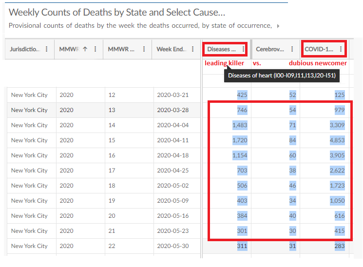
New York City, week 15: of 7,860 total deaths, at least 4,564 were caused by COVID-19. That's 58% - more than the 42% killed by all other causes combined. At the spring peak, covid surpassed heart for nine weeks straight, even with heart deaths seeing a strange surge just then (see compiled table). (CDC source, for this and much else in this article)


In parts of Italy, weekly deaths from COVID-19 were far more than heart disease and all other causes combined. I recall hearing Bergamo (IIRC) suffered up to 800% the normal mortality before the virus was reigned in. If so, that suggests the virus (and/or lockdown, etc. - something new) briefly killed 7x as many as all other causes combined. Don't quote me on that part, but it definitely can kill more than heart disease if allowed. (and some bonus questions: do we see NYC's share of missing heart deaths here? How many more were there supposed to be in those weeks, and why?)

Add 1/31: the 800% mortality I mentioned for Italy also happened in New York City. In the same week 15 when over half the deaths were from covid (confirmed/probable), that number was 780% of normal. Almost exactly 1,000 deaths expected that week occurred, plus covid killing 485% that many on top of it, PLUS 1,930 unexplained excess deaths that include a massive spike of h.a., other covid replacements and co-morbidities, New analysis considers possible lockdown deaths too. See timing of most deaths. Delayed treatment? Not much for cancer in that peak span, and not much room later for any other natural-cause excess. External causes like suicide? It's probably quite incomplete, but by the CDC's data as of now, there's a possible slight elevation at first that gives way to unusually low deaths from week 32 on.


But even a fraction of that known killing power seen in a U.S. average makes no sense to Briand. 31:30 "Hm? It doesn't make sense. Doesn't make sense at all."  She has to ask "what's going on?" and "where have all the heart attacks gone?"  

Comparing to the 2017-18 peak, she finds 367 fewer deaths than "expected" for the 2020 peak 2.25 years later. She marks this (narrow band) as "expected not seen," and then marks a much bigger gap between that and something up past 18,000, labeled +???. I guess she sees a natural spike just like 2018's but bigger for who knows why, and thinks HA should have led at super-peak levels, just naturally there in April. As I measure it, this shows some 3,090 more heart attacks that she (maybe ???) expected to see for that week. Her image with my notes added in mostly red, and explained below.


We'll keep considering this point, but as it tangle with a couple others and all need some space,  header for a related but separate issue. 

Natural Causes Swap-Out

Briefly, the rest of her case for a lot of "missing" deaths before we come back to the details: Around 34min a slide showing "change in deaths over previous week"  for weeks 15-16-17 (and NOT weeks 13 and 14), which make up the downslope of the supposedly low peak she identified above. She notes heart disease declines massively here, as do most other conditions, aside from barely-affected cancers (the lung one has seen suspect increases, the rest mostly not). Briand presumes weeks 15 and 16 should have same or even higher heart deaths, since overall deaths were still increasing, and that's what always happens during death spikes. So she sees the decrease - or at least the size of it - as suspicious. 

Finally, after mistaking the covid peak for the seasonal all-causes death peak, it seems she mistook the following seasonal decline (see above, added aqua-green matching curves) for a continued suspicious decrease into the summer. Prof. Scott Zeger: "The trough in non-COVID causes that Dr. Briand notes that spring is not a mis-attribution of non-COVID deaths to COVID. It is the natural spring abatement of the winter mortality rise that happens every year.” That may not be what she meant, but if so, he's right. I'll add the decline started from the elevated levels many have noted, was steepened by lockdowns and others measures that would limit the spread of all contagions that, as Zeger noted, cause the extra few deaths adding up to the winter spike. Also, that effect in turn is offset some by false covid inclusions that continue - especially into the summer, when "non-covid" excess deaths rise again contrary to usual trends. 

But all these "missing" deaths, not just from heart attack, opened a big fake mystery. And it's not hard to solve - deaths don't disappear, once they're "expected." They simply must be in disguise, hidden in another category. 48min "[the published numbers] are somewhat misleading or some of them are going to be misleading, in that - the data show the number of heart attacks decreased during the peak of total deaths that we experienced, and heart attack is the leading cause of death in the United States. If [the numbers] were not misleading at all, what we should have observed is an increased number of heart attacks and also the increased COVID-19 numbers. But a decreased number of heart attacks - and all the other death causes - doesn’t give us a choice but to point to some re-classification. Not all of them" she hastened to add, just "some" unspecified portion of them. 

She won't call the COVID-19 death toll entirely fake or even fake on purpose, but of course her readers, especially second-hand ones,  just know that can't be an accident, and they're sure the portion of fakery is major or even total. The woman cited at the start understood it: "all they've done is recategorized all the deaths. This is not what they're telling us it is. It's a lie." 

But there is no overall decline. Rather, 2020 saw a large excess of natural causes deaths.  All those expected and more - at least 88,634 NON-COVID natural causes deaths above 2019 levels over a similar span to what Briand studied (to week 36, or 39, incomplete). This is on top of a bit over 200,000 confirmed covid deaths in the same span, all by definition above 2019 levels that were zero. See here for my graphs. Not that I've checked, but the same probably happened with the fall and winter spikes of covid deaths. 

Briand and I have different expectations for 2020 partly because the best available comparison is not 2018 but 2019, with its smooth, low curve that can be seen flowing easily into 2020 (again, see aqua curves in the image above -  they match each other AND the years quite well), but with some early covid-esque spikes. The real mortality baseline for 2020 aside from the virus, and lockdown etc. will be its own story, and things change - as this pandemic shows. But otherwise the change might have been small, so 2019 might be as good a comparison as a well-adjusted 5-year average, or even better. 

The 2019-2020 flu season starts almost a copy of the last, by many signs even a bit lower in fatality aside from covid (not that it's easy to tell). Clearly above the baseline, there are some early bumps of possible relevance at week 39 and 47 of 2019, and a big and clear surge of definite covid deaths just after new year's, just a handful of which managed to be confirmed. Then there was a mild dip and a rise to the massive spike of mortality in the spring most of us have heard about, then another fat, low surge in summer, and we know bigger yet has followed since, growing from mid-autumn to the present (recent 7-day average 3,300 covid deaths per day in the U.S.). Officially, it's near 420,000 now confirmed killed.

Including mis-classified deaths behind those other n.c. excesses, the real toll so far might be some 40-50% higher. Wherever we can see, including all U.S. states, the "non-covid" excess deaths seem to mainly be yet more covid ones. The timing and scale, the similar age bracket, and the elevated causes (mostly known covid co-morbidities) all point to that. From there, lockdown etc. causes a decline in all transmissions - SARS-CoV2, influenza, other - and thus reduces external triggers for heart attacks, etc. which fall to low, seasonal levels, before rising again with the summer covid spike. (Scott Zeger: "the winter peaks ... are associated with respiratory infections that exacerbate many chronic conditions." And note COVID-19 is one of these). And as the JHU News-Letter explained "those with those underlying conditions are statistically more likely to be severely affected and die from the virus" Some of those who would have died of HA etc. died of covid instead, or the two combined. And as they probably realize, some will do that and have the covid part missed, explaining the strange increases. See US. flu-pneumonia deaths - spiking oddly after flu transmission had fallen - it'll be the pneumonia catoegory risen, and guess what they tend to call undiagnosed covid suffocation deaths?


Consider that in late 2019 and early 2020, zero percent of covid deaths were diagnosed properly, even though we now realize they were happening. That doesn't change entirely, not overnight or probably ever. In the first weeks, deaths from solo co-morbidities (heart, alzheimer, cerebrovascular, etc.) and undefined pneumonia were super-elevated. That's probably due to slim diagnosis of covid deaths, both direct and indirect (illness survived, but with exacerbated conditions leading to a swift death afterwards). But identification improved a good bit, and then mis-classified deaths fall (while remaining high) just as covid rises a bit more sharply. And the actual deaths also decline as the cause of them decreases.

Now back to the w15-17 decline: it seems there was a change in classification around early April, besides a peak of deaths in most places. In the United Kingdom, their Office of National Statistics issued a report that mentioned but also soft-pedaled the notion of missed covid deaths and a higher, hidden death toll. This report suggested it was unlikely for influenza-pneumonia (if not other causes) "since Week 14 (week ending 3 April 2020)," at which point they diagnosed more covid deaths and lone co-morbidity deaths (especially this one) declined proportionally. See plate showing the five leading causes of death, with week 14 marked. i/p at bottom falls clearly after that. Others fall or rise less sharply, then increase again, as covid deaths (probably including these) were still accelerating. Mainly, the lesson to draw from this is the change didn't affect most causes that much - they kept on being super-elevated with no real explanation. (it's not lockdown, or denied medical care - see link below)

https://libyancivilwar.blogspot.com/2020/10/covid-19s-evil-twin-lumpin-20.html


It seems a similar thing happened in the US too, just a bit later (see below). The very peak of natural causes deaths was week 15 ending April 11 (US system is offset a day from UK) with only a slight decline in week 16 - nc overall fall a bit as the major covid portion increases a bit. As shown below, the purple area shrinks. This is what that plate above showed in numerical form and missing key context; the fairly insane weeks before, when nc deaths were about 45% above normal. "the total decrease in deaths by other causes almost exactly equals the increase in deaths by COVID-19," as Briand said, at the decline between weeks 15 and 16,  and perhaps for some other spot by coincidence, but NOT as an overall pattern. This is what Briand notices, and it proves what? Levels that insane couldn't last, especially with distancing and lockdowns reducing infection rates all over.


Does Mrs. Briand think there SHOULD have been ~23,000 n.c. deaths above 2019 levels in mid-April, for no reason that can make sense - and since there aren't, 16,000 being rebranded as COVID-19 - or whatever portion of them she means (+3,090???)?  In fact it was a suspicious presence of elevated deaths, seen being reduced but not eliminated in weeks 15-17. And she never asks where that elevation came from, taking it as natural, due to that clear seasonal pattern, comparable numbers, steady age breakdown, etc. 

Here's your missing hart attack deaths - actually over-abundant all year long, compared to same-week levels in the best example year of 2019. “If [the COVID-19 death toll] was not misleading at all, what we should have observed is an increased number of heart attacks and increased COVID-19 numbers." She doesn't even get why that's true, but it happens to be. And it is observed, so what's the deal? She somehow didn't observe.

I've boxed in red the span where program director Briand notes the suspicious decline in weeks 15-17. If you ask yourself WHY these weeks each see a decline from the previous week, instead of rising higher yet to stay ahead of the ongoing covid rise ... the answer is because that only makes sense. How they ever got to that week 15 high is the real mystery Briand ignores, pretending THAT was the normal part of a seasonal death spike that's only 13 weeks late. 

And this is why she decided on missing heart attack deaths. The fact that she claims to have found them somewhere else when they were never missing just adds to the embarrassment.

"Normal Death Numbers" & Conclusion

Briand and company found "no evidence that COVID-19 created any excess deaths. Total death numbers are not above normal death numbers. We found no evidence to the contrary." They didn't find this, or found it wrong. If the latter, and the circular nonsense provided so far IS the explanation, well... that was a big fail. (updated from initial tweet - she was referring only to the span including the first two waves) https://twitter.com/CL4Syr/status/1338522626973523968 


Matt Margolis seemingly noted this disconnect: "So, if COVID-19 has actually had no significant impact on U.S. deaths, why does it not appear that way? To answer that question, Briand shifted her focus..." to the kinds of details addressed above, and simply left the disconnect unexplained. That seems to have worked for a lot of people. But the main problem they SHOULD be stumbling over more is the death toll is clearly NOT low, or normal, or even close. Briand either doesn't realize this, or has issued a very poor challenge to the agreed fact; she disputes the official numbers provided by state governments, as tallied by the CDC, but so far gives no good reason. This, even as she relies on misreading OF those numbers AS valid, to find factual "data" to question their ultimate validity - and thus any work like her own based on it. 

Video, 40:46 "We also found evidence that COVID death numbers were misleading. We found evidence that some deaths caused by diseases of the heart, chronic lower respiratory disease, flu and pneumonia and more were simply reclassified as COVID-19 deaths."
Lead Stories cited this, and rebutted "Briand makes that claim with no reference to specific deaths, doctors or death certificates in which she has evidence a death attributed to COVID was actually caused by something else." It seems this is not further evidence they found, but a reference to all the death causes that appeared low to her. That's the "evidence" that left her "no choice" but to strongly suspect they had been swapped out. 

Lead Stories also cited "Ronald Fricker, Jr., the former head of the statistics department at Virginia Tech, who studies statistical models used in disease surveillance, said Briand hasn't done enough work to make the claims she makes ... He pointed to an October, 2020, editorial and research letter from the Journal of the American Medical Association, concluding that 67% of the excess deaths from March through July "were attributable directly to COVID-19." Regardless, it is clear that the total number of deaths in the United States has increased this year by at least 10% and likely will be 13% or more by the end of December."

Emily Gurley told the JHU News-Letter "that because Briand’s presentation does not specifically examine excess deaths, her conclusions are flawed. “Researchers (from both within the CDC and outside) have already analyzed data on vital statistics to show that >300,000 deaths have occurred in 2020 than occurred during the same time in other recent years (after accounting for changes in the size and age of the population),” Gurley wrote."

And Sourya Shrestha, a research associate in the Department of Epidemiology at the School of Public Health (again, not economics), "elaborated on the standard method used to calculate excess deaths. He asserted that comparing death counts week-to-week as Briand did fails to account for two important considerations: random fluctuations and seasonal trends. “A more robust way [to calculate excess deaths] is to construct a baseline of expected deaths using trends from past data and compare that to the observed deaths,” he said in an interview with The News-Letter." He describes the method used by the CDC ...

"The Morbidity and Mortality Weekly Report, published on Oct. 23, reported that 299,028 excess deaths occurred from Jan. 26 to Oct. 3. About two-thirds of those deaths were attributed to COVID-19. Other peer-reviewed papers have reported similar findings." (and I'll add at least a majority of the other 1/3 are suspect)

Gurley noted that the data presented in the webinar failed to address these statistics and did not demonstrate that officially reported numbers were wrong. “There are no data in this presentation that show that previous reports on the magnitude of deaths from COVID-19 are incorrect,” Gurley wrote.

And finally, a point no lockdown critics consider well, and Briand seems to ignore entirely - how many deaths MIGHT we have seen if the measures of March and April hadn't been taken? Infections were artificially limited, all-cause deaths fell soon after that, and they complain that shouldn't have happened - the vulnerable should have been put in magical bubbles and everyone else turned loose to develop herd immunity with no vaccine safety net needed - if their advice had been followed, my God what a massacre.

---

bonus: From the twitter Q&A, Briand arguing that 2020 deaths were not just normal but a bit low. Agaian, she picks absurd expectations, and dashes them with the help of some bad math, so she can make another case for mass fakery. 

Briand's 2019 deaths: 2,852,609 vs. my tally from possibly revised numbers: 2,791,887

Briand 2020: 

* expected by year's end: 2,894,771  vs. 3,349,566 incomplete final tally when I looked (from here, careful tally of weeks)

* expected by 9/31 (week 39/40): 2,880,717  vs. 2,436,055/2,494,251 as logged now 

** vs. seen then 2,402,953 (even more "less than expected!") 

**  vs. 2019 through w39, ending 9/28: 2,123,698 (a decent basis NOT to expect 2.88 million as normal for the following year)

* expected w41-52 (to year's end minus to 9/31): 14,054.  This is about one week's deaths, not three months' worth. vs. 855,315 actually logged, still a bit incomplete. 

* Why less deaths? She doesn't know. Maybe less traffic accidents? No. That's a tiny class of deaths - not sure, maybe 1-2% of the total, cut by maybe 1/3 on average. Suicides are a bigger class yet, and alcohol/drug OD bigger yet, and both of these were elevated in 2020 (some of those "lockdown deaths" that do exist). Those would more than offset any such decline in deaths from external (un-natural) causes. Exact numbers aside, even these are small compared to any leading natural cause, tiny compared to what COVID-19 has done, and miniscule compared to what it could have done if left un-checked.